(Murad Banaji, 23/05/2020)
We use the stochastic, agent-based model previously described (description at /research/modelling-the-covid-19-pandemic/, code at https://github.com/muradbanaji/COVIDSIM) to make some remarks about the mechanisms by which lockdown can slow the spread of COVID-19, focussing on the Indian data. First, some general remarks.
We know that lockdown has two effects: enforced physical distancing; and geographical localisation, leading to a more spatially heterogeneous pattern of disease. Physical distancing alone can reverse an outbreak, but would have to be very rigorous to do so if the R0 value is significantly larger than 1. For example, modelling suggests that geographical localisation was key to how the German outbreak was effectively controlled despite initial rapid spread. Note that the outbreak, so far, has been brought under control without disease ever reaching the great majority of the population. The signature of this is in the way that cumulative infection and death curves, plotted in logarithmic coordinates, smoothly flatten as seen in Figure 1. This is consistent with the hypothesis that disease was effectively confined to some localities, where “locality” is to be read broadly, and could include, for example, a neighbourhood, a household, or a care-home. These localities included, in total, only a relatively small fraction of the German population.
Disentangling the effects of physical distancing and disease localisation. Undoubtedly both physical distancing and geographical localisation have proved important in slowing the Indian outbreak. Regional data shows that the effectiveness of lockdown at reducing transmission depends on the speed of initial transmission. For example, Gujarat had rapid early spread of disease (comparable to that seen in European outbreaks), and to model lockdown in Gujarat we need to assume that lockdown reduced transmissions by 60%. To model data from Maharashtra where the initial spread was slower, we needed to assume that lockdown reduced transmissions by 42%.
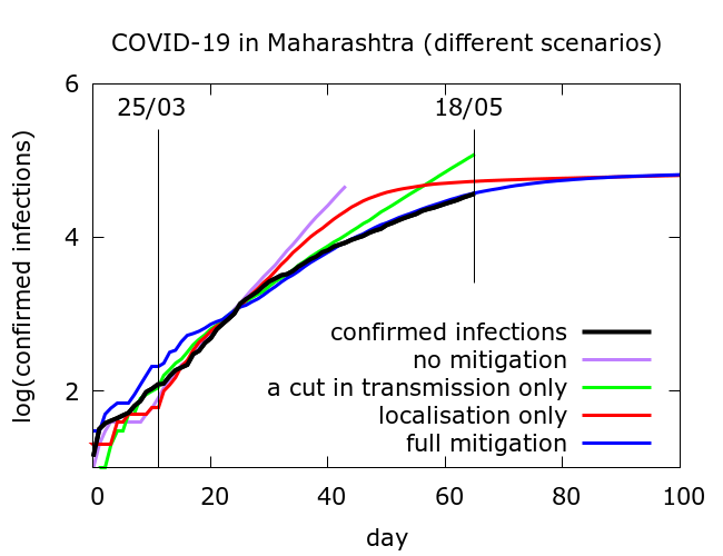
Simulation allows us to try and disentangle the twin effects of enforced social distancing, and geographical localisation on disease progression. Figure 2 includes confirmed infections data from Maharashtra at https://www.covid19india.org/ along with typical trajectories from simulations with (i) no mitigation; (ii) some physical distancing but no disease localisation; (iii) disease localisation but no additional physical distancing and (iv) both effects. In all cases, for computational reasons, simulations were stopped if total infections (not shown) reached 10 million. All of the modelled curves follow the data until about 10 days after lockdown begins, after which they diverge, but in rather different ways.
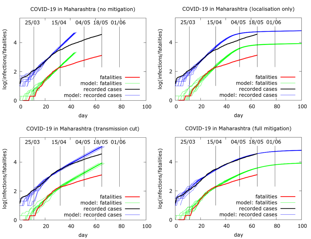
The full sets of simulations from which the curves in Figure 2 are drawn are shown in Figure 3. Model parameter values used to generate the plots in Figure 3 are given in the Appendix. We see that moderate physical distancing slows transmission, but the curves do not “flatten”. On the other hand disease localisation takes longer to manifest its effects, but succeeds in flattening the infections and deaths curves.
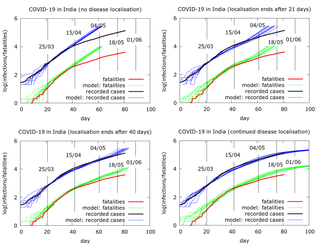
Simulating the effects of an early end to disease localisation on the Indian epidemic as a whole. Simulations of the Indian data as a whole can be used to explore what happens if disease localisation caused by lockdown fails to occur or is stopped early. Even with physical distancing, without disease localisation, we would have a much larger number of infections and deaths today. If restrictions on movement had ended after, say, phase 1, then again we would face a larger volume of disease today, although not quite as catastrophically large as in the “no-lockdown” scenario.
An attempt to quantify the effects of disease localisation is presented in the simulation in Figure 4. All the simulations use a model fatality rate of 0.5% and we consider the time to get to 20 million infections under different scenarios. With full and continuing lockdown, there have so far (as of May 22nd 2020) been a total of about 3 million infections nationwide, heavily concentrated in a few hotspots. Testing has picked up about 4% of these and about a third are currently infectious. Infections do not reach 20 million by the end of the simulation (Figure 4, bottom left). With no localisation, i.e., with physical distancing at pre-lockdown levels, but no “lockdown” as such, total infections would already have reached about 20 million by about May 5th (Figure 4, top left). If lockdown had ended after the first phase (April 15th), this figure would have been reached around mid-May (Figure 4, top right). A forty day lockdown would delay the time to 20 million infections by another ten days or so (Figure 4, bottom left). The parameter values used to generate the pictures in Figure 4 are given in the Appendix.
Appendix
Here are the parameter values used to generate the 4 plots in Figure 3. Note that a scaling was applied to speed up computations – all populations appear at one tenth of their value, and death rates are multiplied by 10.
Figure 3 (lexicographically ordered)
number_of_runs 10
death_rate 5.0
geometric 1
R0 4.0
totdays 150
inf_start 3
inf_end 14
time_to_death 17
dist_on_death 6
time_to_recovery 20
dist_on_recovery 6
initial_infections 10
percentage_quarantined 3.7
percentage_tested 100
testdate 12
dist_on_testdate 6
herd 1
population 4000000
physical_distancing 0
pd_at_test N/A
pdeff1 N/A
haslockdown 0, 1, 1, 1
lockdownlen N/A, 150, 150, 150
infectible_proportion N/A, 0.02, 1, 0.02
lockdown_at_test N/A, 7, 7, 7
pdeff_lockdown N/A, 0, 42, 42
popleak N/A, 2000, 2000, 2000
popleak_start_day N/A, 0, 0, 0
sync_at_test 100
sync_at_time 25
Here are the parameter values used to generate the 4 plots in Figure 4. Note that a scaling was applied to speed up computations – all populations appear at one twentieth of their value, and death rates are multiplied by 20.
Figure 4 (lexicographically ordered)
number_of_runs 10
death_rate 10.0
geometric 1
R0 4.2
totdays 150
inf_start 3
inf_end 14
time_to_death 17
dist_on_death 6
time_to_recovery 20
dist_on_recovery 6
initial_infections 10
percentage_quarantined 12
percentage_tested 50
testdate 12
dist_on_testdate 6
herd 1
population 4000000
physical_distancing 1
pddth 1
pdeff1 30
haslockdown 0, 1, 1, 1
lockdownlen N/A, 21, 40, 150
infectible_proportion N/A, 0.0042, 0.0042, 0.0042
lockdth N/A, 10, 10, 10
pdeff_lockdown N/A, 30, 30, 30
popleak N/A, 4100, 4100, 4100
popleak_start_day N/A, 14, 14, 14
sync_at_test 50
sync_at_time 25